Showing posts with label Tutorials. Show all posts

Tuesday, October 7, 2008

Tutorial - Adding a New Background in Blogger

If you haven't noticed already, I've changed the look of my blog to this wonderful blue. Want to know where I got it? I made it from the "It's Ladies Night" kit by Ginger at GingerScraps!! Head on over there and grab this fab kit inspired by the wonderful Sex and the City!

Lately I've had a lot of requests asking for help on getting blog layouts set up. For some reason, the directions that are usually given with the layouts people download are not all that great so this is my attempt at giving a little help for those that aren't that familiar with blogger, html or CSS. This is just a quick little how to on adding a background and maybe later I'll get into some more in depth stuff. First, I want to point you to a great blogger resource at http://tips-for-new-bloggers.blogspot.com there is a lot of great information on fixin' up your blog. However, they get a little technical sometimes so if you have any questions about what they are talking about just leave me a note.

Now, on to the tutorial.

First lets start off with logging into Blogger. Once you're there get over to your dashboard. (Usually when you log in it'll take you straight to it, however if you're looking at your blog you can click on 'customize' in the top right corner, then click on dashboard.)

blogger dashboard  Next, click on where it says Layout. This should bring you to a page with the following menu.

edit html menu

Click on where it says Edit HTML. Once you're there, the first thing you want to do is make a back up of the template you already have. That way if you don't like the changes that you've made you will have something to go back to.restore template

Click where it says "Download Full Template" and save someplace that you can find it later if you need it.

One you've saved your old blog, scroll down a little further to the edit box:

edit template box See at the bottom of the box where it says variable definitions? What you're going to do is scroll down just past all those lines that say variable until you find the line that says "Body"

scrolldown

Alright, see there in the middle of the box (above) there's the line that says "body" and then I've highlighted the code that we'll be working with:

highlighted body text

Note: If you want to learn more about the syntax of the HTML/CSS coding there's a great website HERE that you can check out.

I'll go through a few CSS/HTML code basics just so you know what I'm talking about.

The basic CSS is a combination of a Selector or tag, then a property and finally a value of that property. In this tutorial we will be working with the Selector/tag: BODY, the property: BACKGROUND and the values that go along with those. Those will include centering the image, setting the position and scroll actions. More about those in a bit.

Right now we are going to take a look at the first line with the BACKGROUND property;

background: #000000;

All this line does is set the color of your blog background (the color that shows up UNDER the image you'll be adding) using the 6 digit HTML HEX CODE as the value for this line of CSS code. I usually try to set this to something that matches the image that I'll be adding, but that is not necessary. It's possible that you may not even have this line in your code, DON'T WORRY, it's not important. (#000000 = black)

The next thing we are going to do is add 4 lines to the Body tag. They will look like this: (Copy and Paste)

background-image: url(http://www.link.com);
background-position: center center;
background-repeat: no-repeat;
background-attachment: fixed;

Here's a picture of what the code looks like with these lines added:

finished code

Here's a little breakdown of each line for you plus other variables that you can experiment with if you like. (take advantage of the PREVIEW button)

First is the background-image line. This is where you will add the link for your new template image. Your design should be at least 1024 pixels wide. This way you can be sure that it will fit properly on most computer screens. Unfortunately, everyone's is different so you have to take that into consideration. Something that looks perfect for you may be completely off for someone else. Make sure you insert your web address between the (brackets).

background-image: url(http://www.photobucket.com);

The next line is background-position. This tells blogger to align your image where you want it. Again for proper viewing purposes, you want to be centered, that way no matter what size the screen, it'll line up with your blog text properly. So, for this line you'll want to set the values at center center. The reason for two is so it centers your image vertically AND horizontally.

background-position: center center;

Other values include:

top left
top center
top right
center left
center right
bottom left
bottom center
bottom right

Alright, on to the 3rd value: background-attachment. There are only two values for this property. Scroll and fixed. On my blog, I have this value set to fixed. Unless your background image repeats seamlessly, I suggest keeping it fixed. (when you scroll you see the text move over the image and the background stays in place) Go ahead and experiment with both values and see what works best for your blog.

The last line that we'll be working with is the background-repeat property. There are 4 different values for this property:

repeat - tiles your background image horizontally and vertically
repeat-x - tiles your background horizontally only
repeat-y - tiles your background vertically only
no-repeat - does not repeat your background image

Feel free to experiment with these values as well. But you'll probably find that the no-repeat works best with your fixed attachment.

background-repeat: no-repeat;

That's it! Preview to make sure it's working properly and click SAVE TEMPLATE!

Using Creative Lettering to Enhance Your Layouts

[Note: This was an article that I found at Gather.com and I thought that it had some great advice that I wanted to share with you. The focus of this article is for traditional scrapbooking but it's a great source of info and ideas for digital also.]

When you're putting together a scrapbook page, it's the little things that make it unique.  The carefully planned layout, the choice embellishments, and the shapes of your pictures all come together to make a page special.  To top it all off, you need some beautiful lettering for your title and journaling.

Some scrapbookers shy away from doing their own lettering, usually because they are not pleased with their own handwriting.  They use stickers or die cut letters to make titles and do their journaling with their word processing programs.  While there's nothing wrong with that, it doesn't provide for much individuality.  Learning to do your own creative lettering gives you much more flexibility.

Creative Lettering Books and Software Can Help

There are numerous books for scrapbookers that focus exclusively on creative lettering.  Most of them have lots of different alphabets, complete with samples of every letter and number.  Some are easy enough to do freehand, while more complex ones require tracing.

There is also creative lettering software.  It also includes a large selection of fonts, and some programs allow for searching available fonts for certain characteristics.  These programs can be used to print out titles and journaling directly, or you can type them in, print them, and then trace.

Creative Lettering Tips

Creative lettering isn't something that you can pick up in a snap.  It takes practice.  Here are some tips to reduce the learning curve:

* Choose a lettering style that fits well with the subject of your page.  For example, if your page is about a visit to the beach, a highly formal alphabet is probably not the best choice.  Selecting one that is pretty yet casual will make your page flow better.
* For your first few attempts, you might want to do your lettering on a separate sheet of paper, then cut it out and paste it onto the page.  That way if you make a mistake, you can simply start over with more paper rather than having to completely redo your page.
* If you're worried about making your lettering straight and uniform, draw some very light lines in pencil to go by.  Using three lines, kind of like the paper that children use when learning to write, will help you keep both your capital and your lowercase letters the right size.
* Don't try to use an ultra-fancy style when doing extensive journaling.  It's better to stick close to your natural handwriting when writing long passages.  By all means, feel free to embellish a bit and emphasize important words, but don't expect yourself to write hundreds of words flawlessly in a style that's far from your own.

The right lettering has a way of pulling a scrapbook page together.  And it's even better when you do the lettering yourself, because it adds a certain amount of personality to your pages.  Creative lettering might seem intimidating at first, but with some practice, you'll soon be making lovely titles and journals.

Do check out more Free Scrapbooking Ideas and Digital Scrapbooking Ideas to help you create that beautiful scrapbook!

Thursday, August 28, 2008

Blinkie Tutorial Basics - Fading Text

When I started making my own Blinkie's, I searched high and low for tutorials on how to make them. There really aren't any specific tuts on "Blinkie's" as we (in the digi-scrap world) know them. Meaning the 150 x 50 pixel blinking box, usually containing the words "fan of" or "I design for" and such. So, I decided that I would put together a few tutorials on the basics of blinkie making using Adobe Photoshop and ImageReady.

Not familiar with these, you can read a little about the Photoshop family of programs at - Adobe.com

I first learned how to make them using Photoshop 6.0. It was a very old version of Photoshop, and I wasn't able to get very far. Here is my very first blinkie:
Photobucket
You can see here that it wasn't very smooth, and the transitions were awful. Then, I received a copy of Photoshop 7.0:
Photobucket
This blinkie has much better transitions and it flows much smother. One of my favorite transitions of this blinkie is the Fade and that is the first tutorial that I will be putting together for you. While I'm at it, I'll explain some Photoshop basics too.


Part I - Blinkie Tutorial

Getting Started - Photoshop Basics


Photobucket

Here is the final .gif file that will be made using this tutorial. As you can see, very basic. But, an essential skill for mastering the making of a blinkie.


Step One: Open a new file

Open Photoshop

Go to File>New and choose the settings shown above.

I always start with a transparent background for all of my work, but you can start however is more comfortable for you.

Click OK and your screen should look a little something like this:

I've pointed out some of the main elements of Photoshop that we'll be using, just in case you're not totally familiar with the program. Also, take note that in my previews I am using a file size of 300 x 100 so it is easier for you to see.

Step 2 - Fill your workspace with color

This is a pretty easy step. First, click on the paint bucket Icon. I have outlined this button on the tools pallet to the left with Red.

Next Click on the foreground color picker. Here I have outlined it in blue. (Specifically the Foreground is the pink box and your background color is the white box.) If you're still a little confused you can move your mouse to the button in question and let it sit there for a second, a box will pop up and tell you what that button is.

When you click on the color box you should see a window like this:

For this tutorial, I am using a Pink color #F4DBF9 as the foreground. If you would like to do the same you can enter those 6 digits into the box that I have highlighted Blue. If not go ahead and choose the color you want to use and click okay. (click a color on the color spectrum to the left of the large box, then it will show up at the right. From there you can choose the specific shade of that color)

Here's a useful website that gives you the 6 digit codes for different colors: http://html-color-codes.com/

Okay, you have your paint bucket ready to go with the correct color in hand. Now just click in your work space and your 150x50 space should be filled with the color you picked out.

Step 3 - Add your text

Click on the text tool, I have outlined it in Red for you. At the top of the screen you'll see the area where you can choose your text and font options.

Here, I have chosen the "Adorable" font at regular size/style, 10pt and smooth. I've also chosen the 'center' alignment. Lastly, make sure to set your font color. Reminder: I'm working with a larger workspace, 300x100, so you may need to adjust your font pt size to something smaller then 10.


I've outlined this option in red. Click and choose your color just like in the previous step.

Once you have chosen your font and font color, click the center of your work space and start typing.

Step four - moving your project to ImageReady

That's it for the Photoshop part of this tutorial. Click the button at the bottom of the tools pallet. It is the Quick Exchange button between Photoshop and Image Ready.

It looks like this:

Once you push that, Image Ready will open up and automatically load your work space.

Part II - Blinkie Tutorial - ImageReady - Fading Text

Alright, Now... On to ImageReady. Your screen should now look a little something like this:

ImageReady.screenshot.1 copy
Let's focus our attension on the Layers Pallet. It's in the bottom right hand corner of the screen. Here's a close up:

ImageReady.layerspallet.witheye copy


This box shows you each layer of your work space. For this project there should only be two (2) layers. The first being the text layer. (highlighted with the 'T' icon) Then there is your background layer (layer 1).


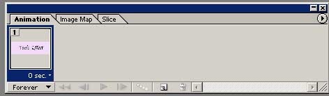
Now, lets have a look at the Animation pallet. This one is usually located in the bottom left and looks like this:

ImageReady.animation.pallet copy

This works much like a slide show. Right now there is only One "slide". ImageReady refers to these as Frames.

ImageReady is open and you're now familiar with the main components that we'll be using. On to...

Step One - Adding Frames

You want to set yourself up with the First and Last frame of your animation.

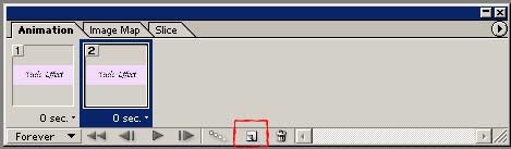
ImageReady.animation.2layer copy

Start off by pushing the 'duplicate frames' button which I have highlighted above. You should now see two of the same frame. Make sure that your new frame is highlighted before you move on to step two.

Step two - preparing your layers

Take a look again at your layers pallet. Notice the symbols to the left of your layer titles? They look like a little eye: eye Go ahead and give those a click and watch what they do. When the eye is removed you should no longer be able to see that layer in your workspace. Go ahead and click the eye on your text layer.

ImageReady.layerspallet.withouteye copy


This is what your layers pallet should look like now. Be sure that you can still see your background image.


Step Three - Making your animation

Take a look at your animation pallet again. It should look like this:

ImageReady.animation.2layerhidden copy

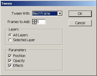
You have your first and last frames of your animation ready. Now, click your first frame and make sure it's highlighted. Then push the 'tween' button at the bottom of the animation pallet. It looks like this: tween

tween.window copy


This is the window that should pop up once you push the tween button.


Note: make sure that your first frame is highlighted. Plus, you can change the amount of frames that are used. Choose more for a slower fade or less to fade faster.


Click Ok.

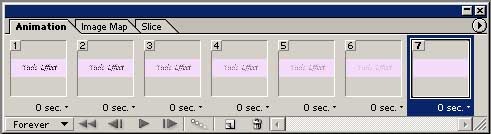
imageready.animation.7layers copy

Your animation pallet should now look like this. Your two original frames along with the 5 extra frames that were added. Go ahead and push the play button to watch your newly made fading text.

Step four - Saving your blinkie

go to file>save optimized as...

This will automatically save it as a .gif file. Just name it and click ok. From there be sure to upload it into your favorite photo hosting site (flickr, photobucket), grab the code and post your newly made fading text blinkie anywhere you want.